How To Build a Colour Palette That Works Across a Whole Home, With Steve Cordony
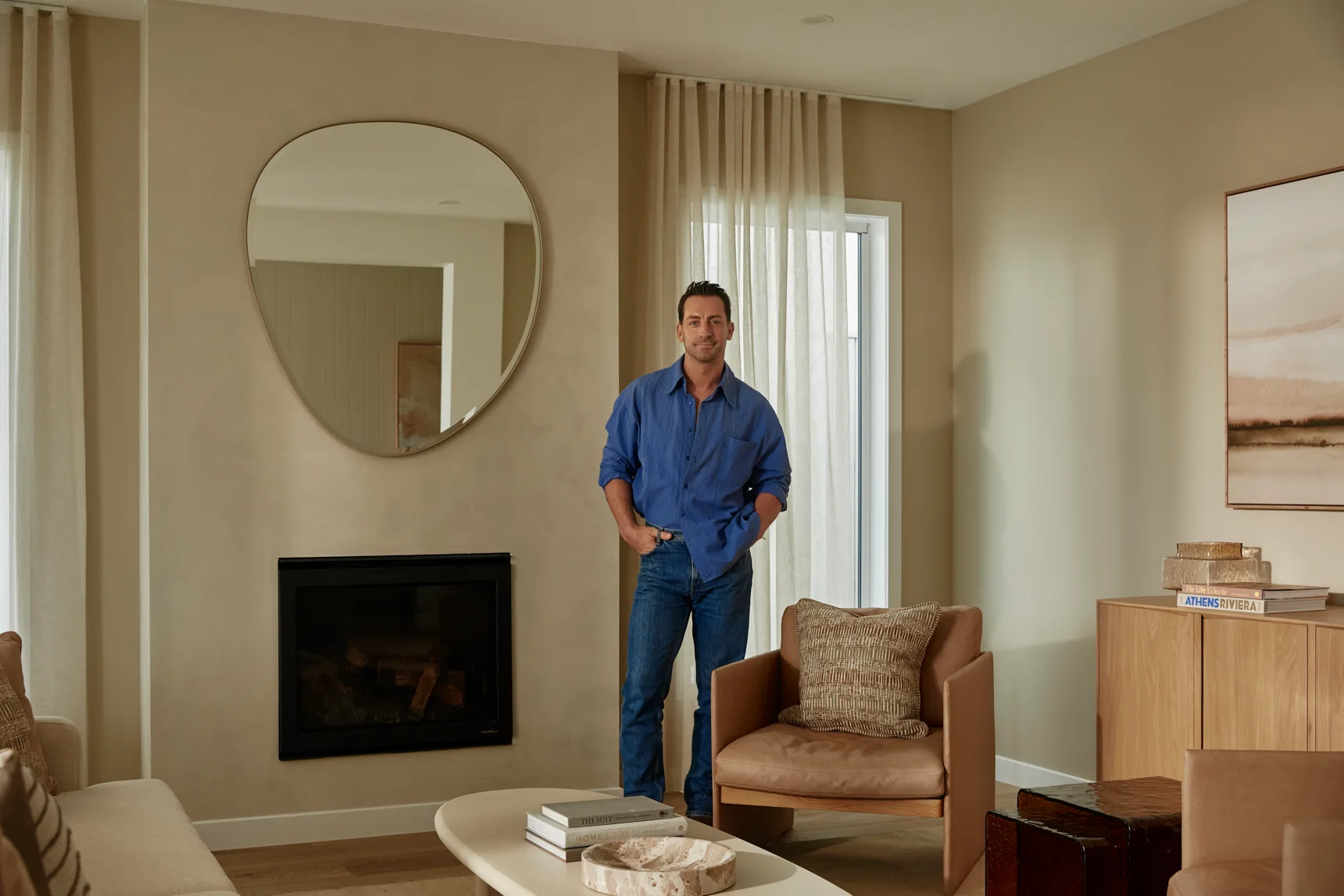
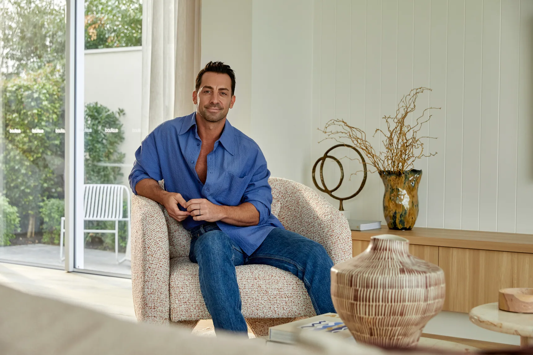
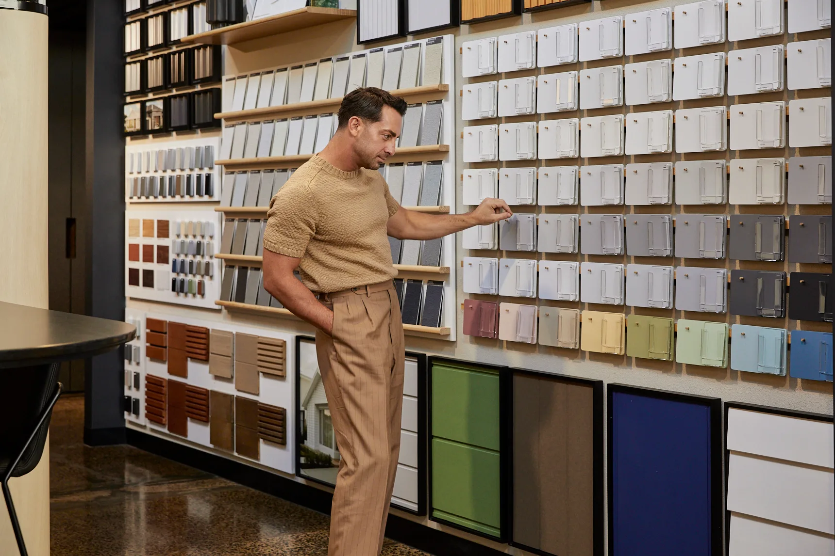
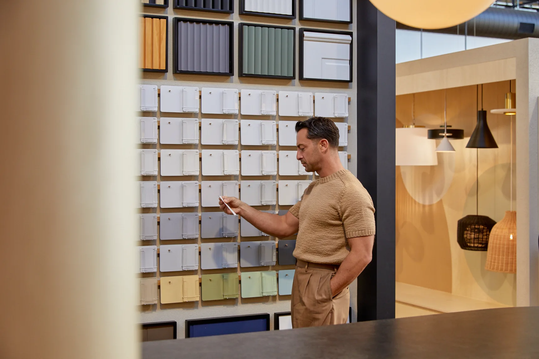
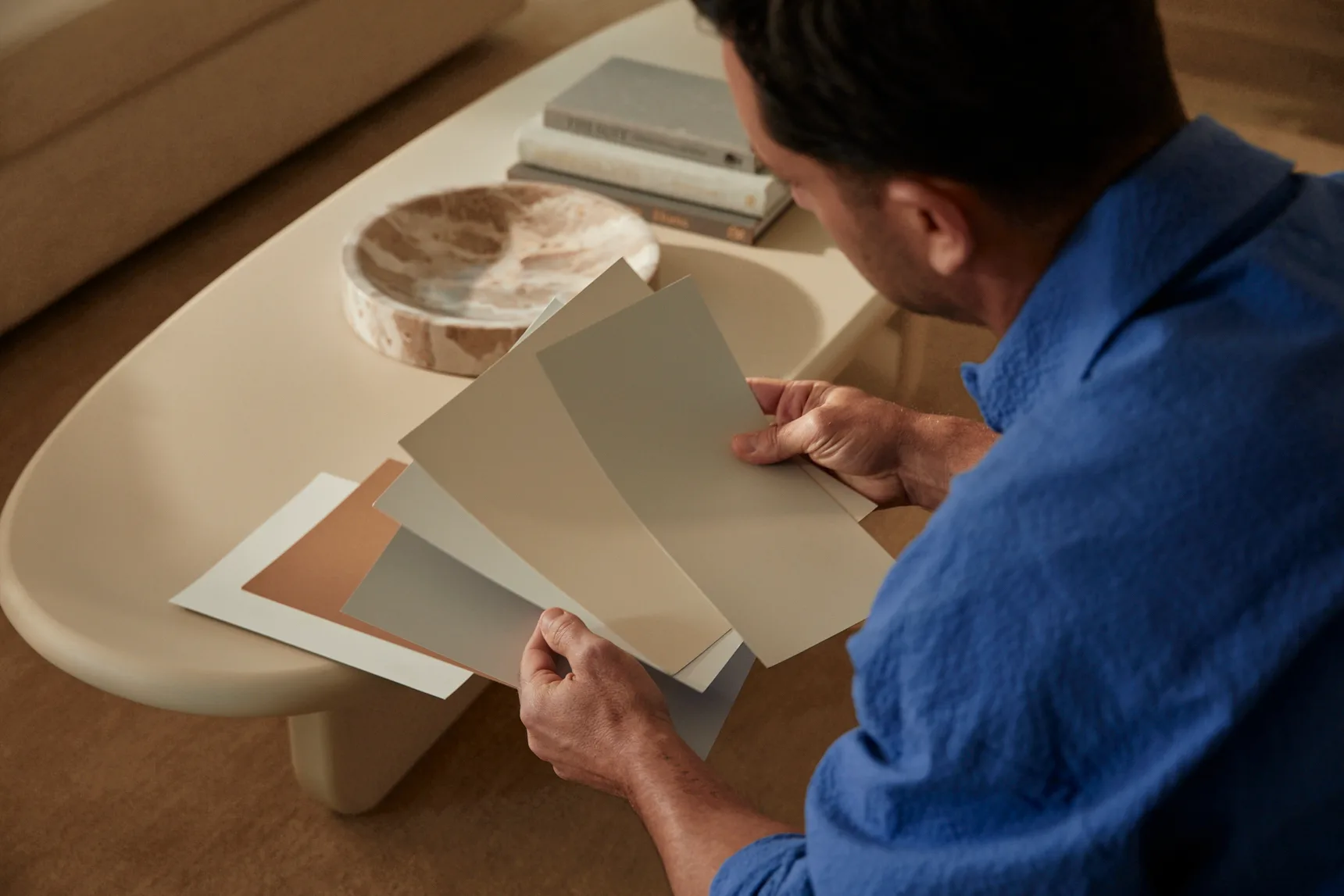
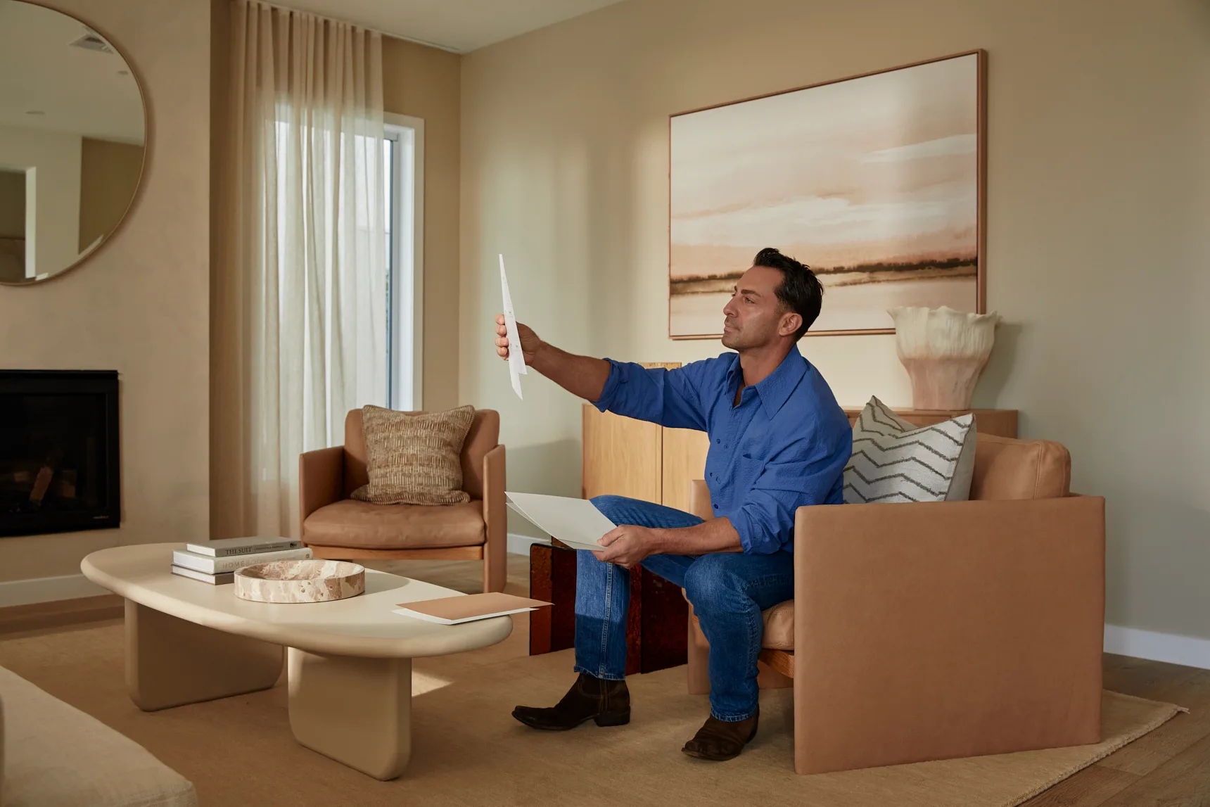
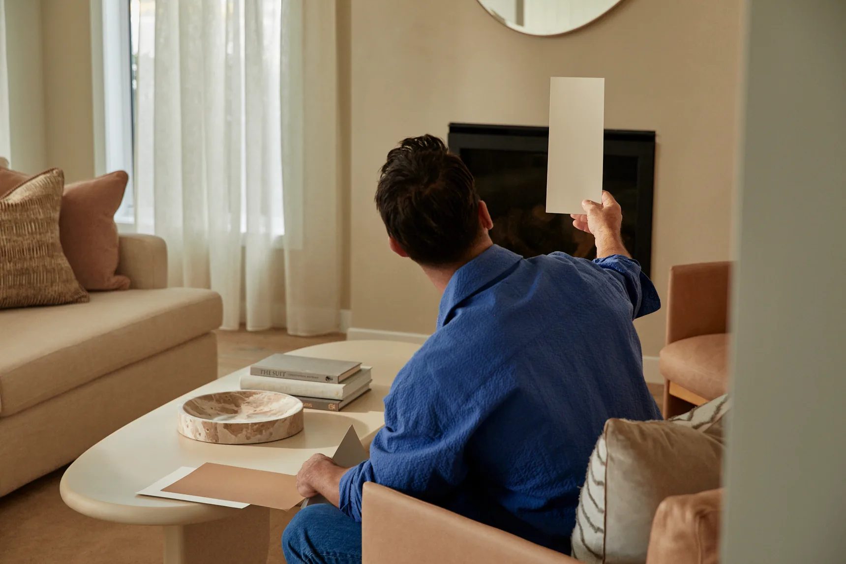
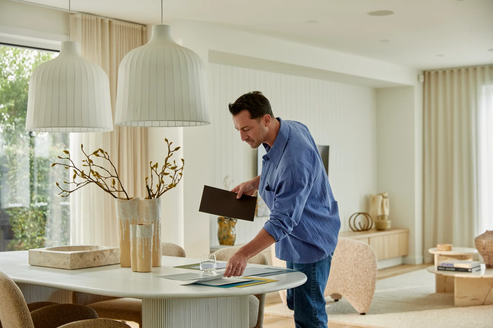
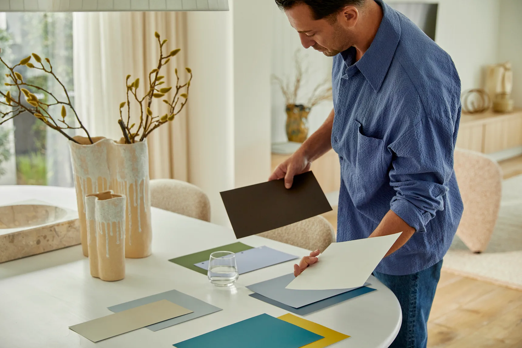


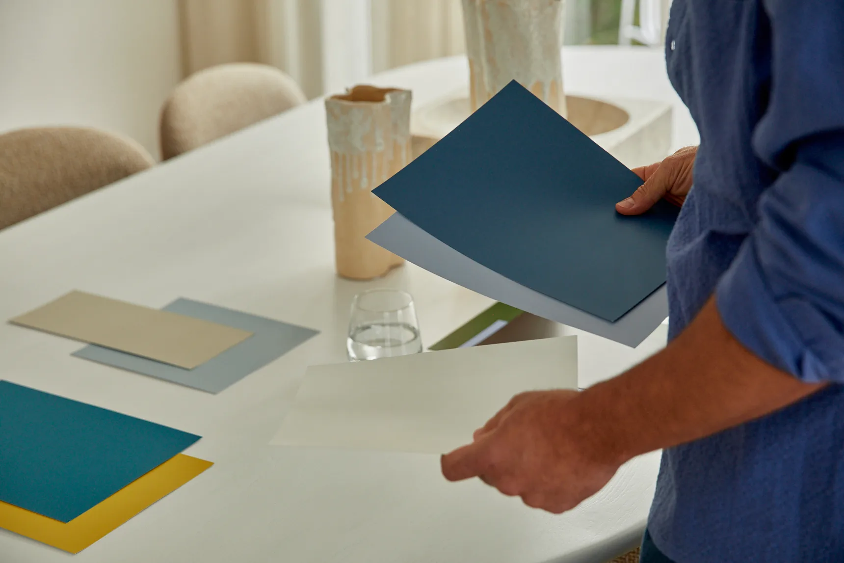
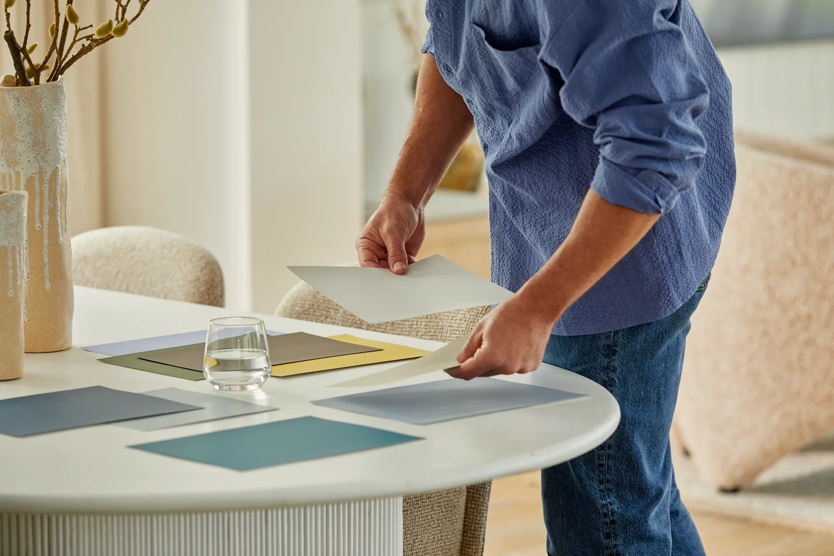
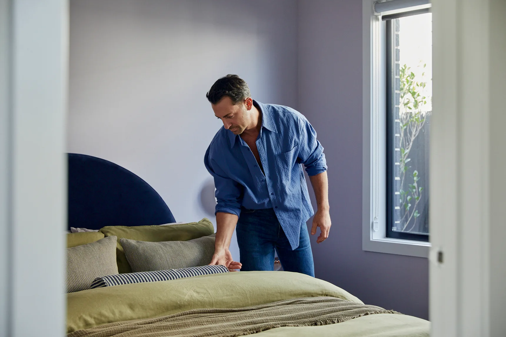
The colour palette we select for the place we live is so much more than background noise. For Steve Cordony, it’s a way to give physical form to our feelings.
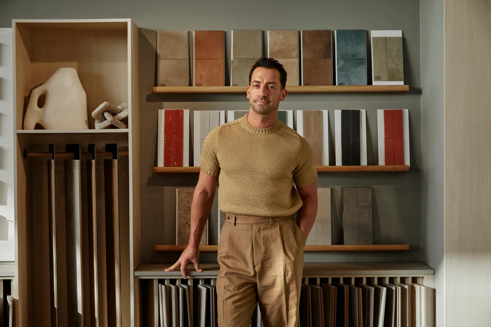
The leading Sydney interior stylist is a master curator of colour, beauty and emotional storytelling in homes. He’s also an ambassador for both Victorian premium home builder Boutique Homes and Dulux, and is using this special partnership as a way to share his expertise in seamlessly blending colour into the design of your home in fresh ways, using the latest trends from the Dulux Colour Forecast 2027.
Cordony sat down with Broadsheet to shine a light on colour, from next year’s star shades and practical colour palette advice to how to use colour to tell a story.
Colour sets the mood
“Whenever I’m designing a space, I want people to instantly walk in and feel whether it’s enveloped, whether it’s calm, whether it’s dark and moody, whether it’s sensual. And colour is really the first point of call that can create that mood,” Cordony says.
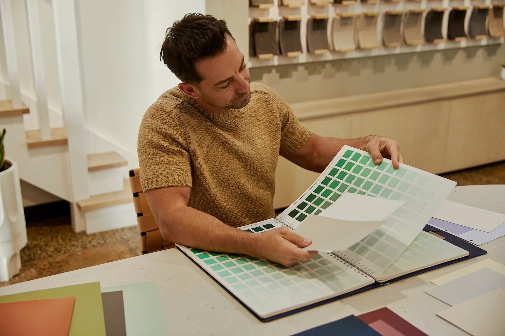
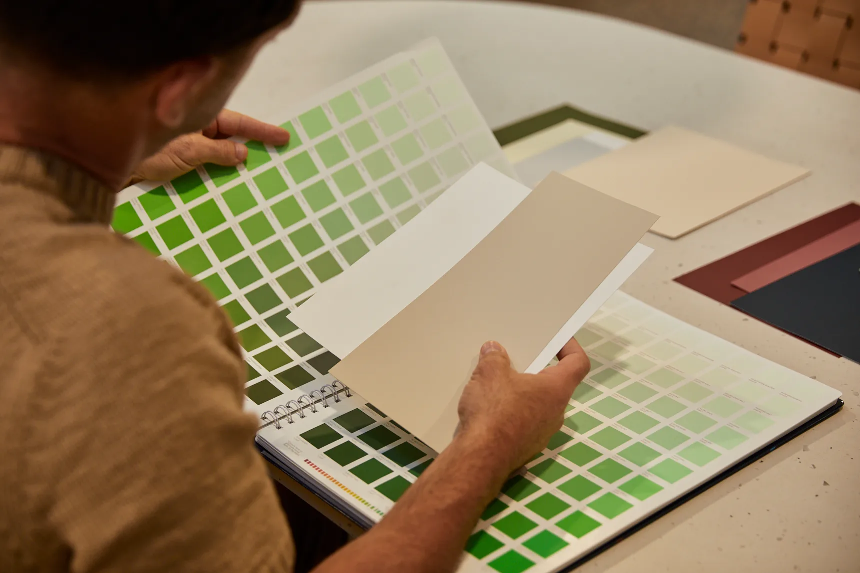
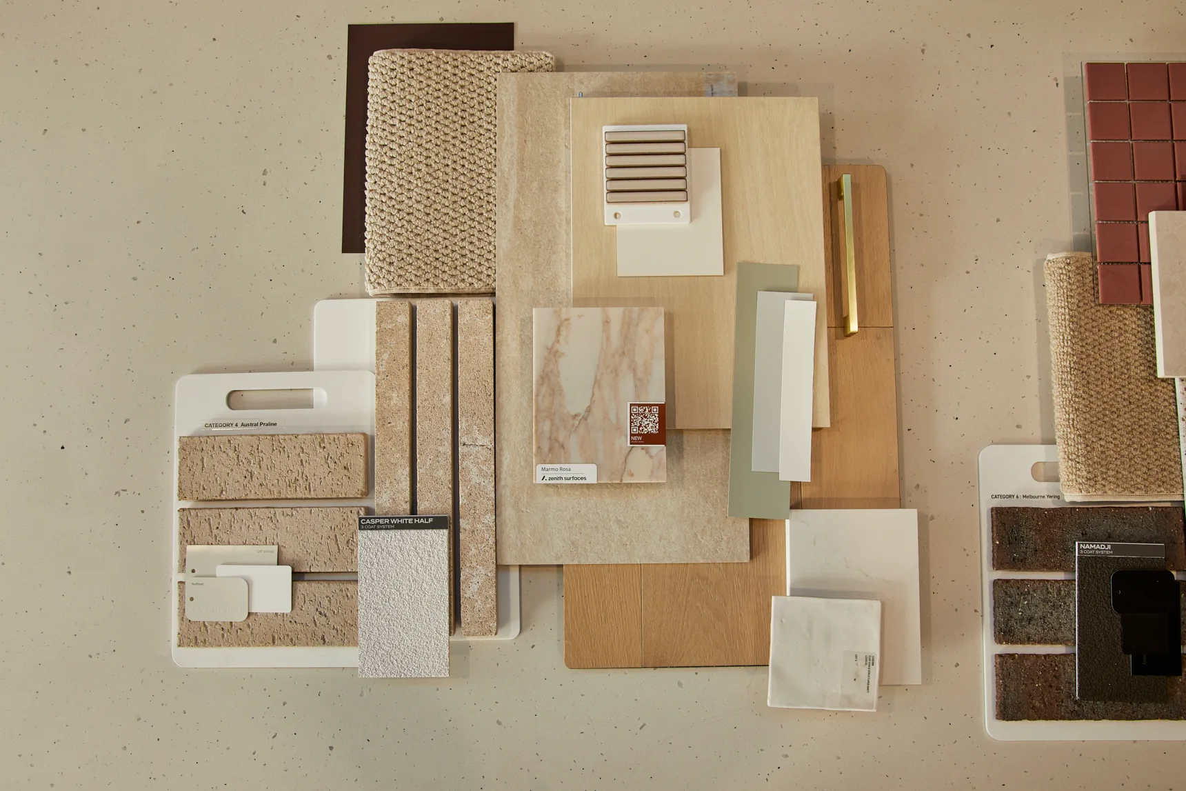
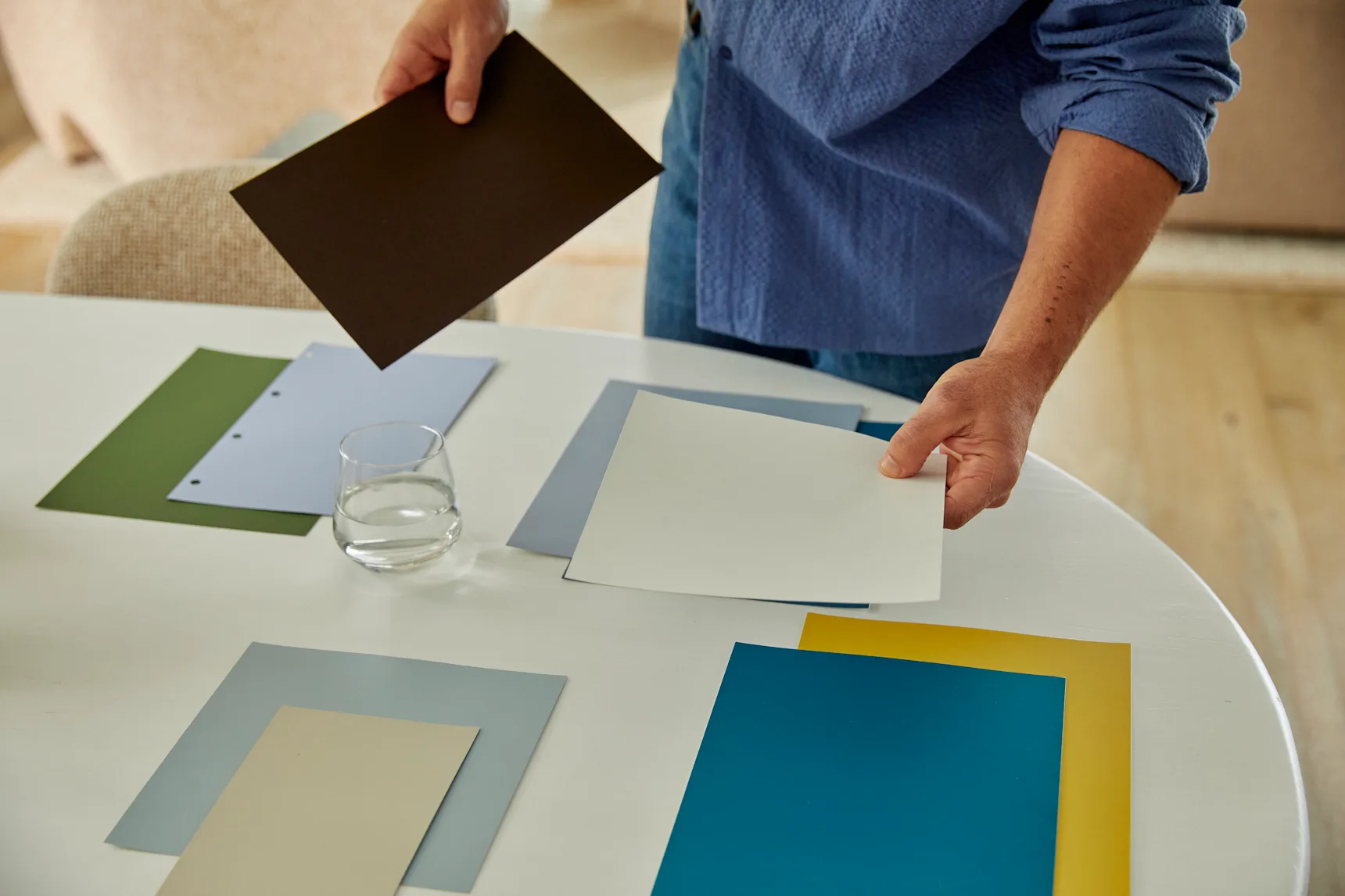
In the early stages, Cordony draws inspiration from travel and nature, which he then translates into mood boards that lead him through his whole design process. If he’s thinking of nature and the earth, he might focus on rocks and moss. “From there, I choose the colour palette, so maybe it’s a warm grey to represent the stone, and then it’s a beautiful shade of green to represent the moss and nature and tropical foliage.”
Know what you’re going for
The first thing to think about is your overall style, followed by the architecture and location of your home – these will dictate some of the palettes that would work. “If you’re very coastal, then your colour palette is going to instantly go to soft greys and whites and blues and soft sage greens,” he says. If you live in the city and want something richer and edgier, Cordony recommends charcoals and deeper colours like maroon and rust. This principle runs through Boutique Homes’ range of interior design styles, with each developed to complement the home’s architecture from the ground up.
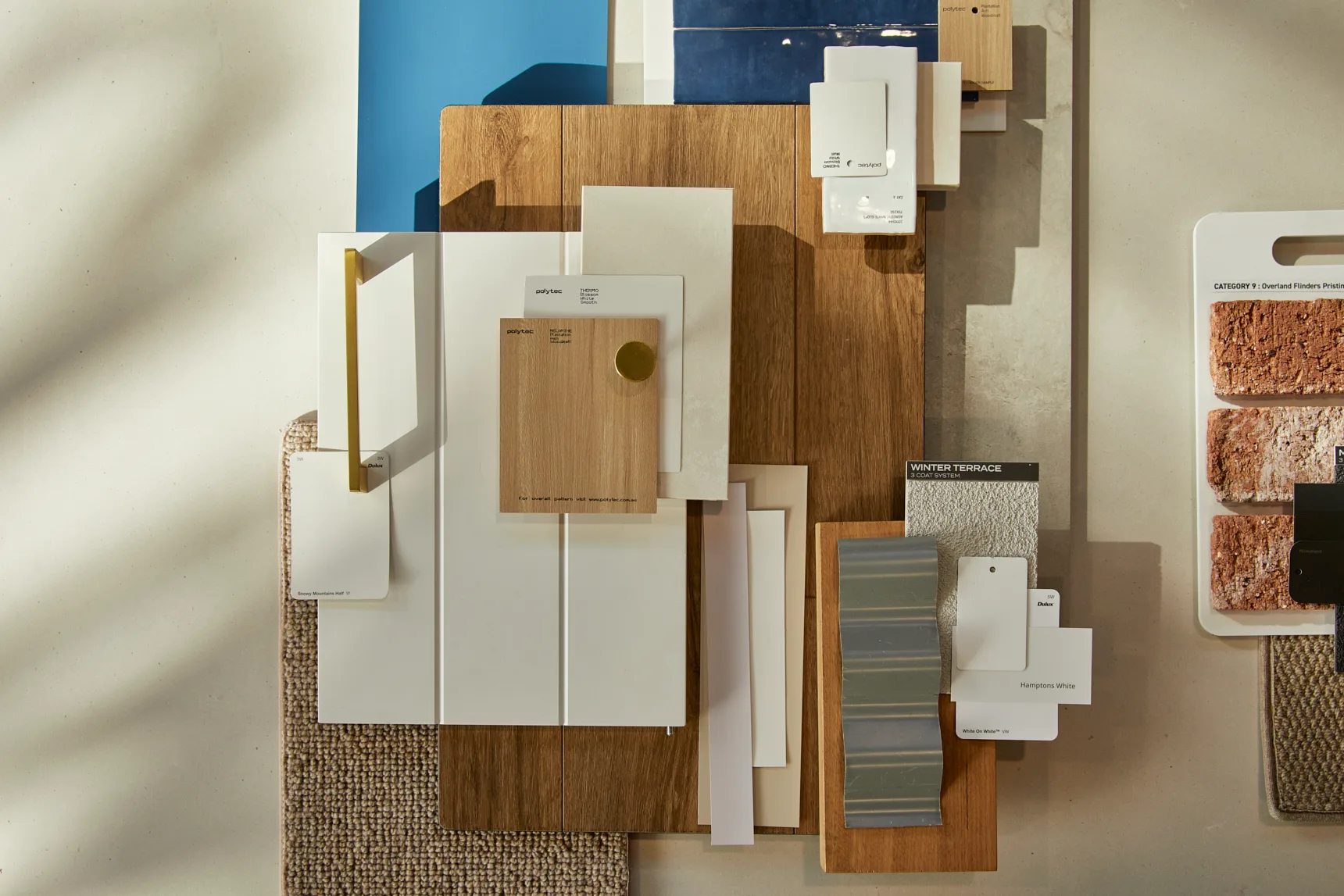
While he acknowledges that some people can use kaleidoscopic and eclectic colour schemes in incredible ways, he advises that for most of us, the final effect tends to be stronger if kept streamlined. “It’s nice to have this idea of monochrome and keeping a neutral palette with a lot of the big items … not only the walls, but [also] furniture, and then add an accent or a pop of colour that allows you to start to build that colour story around that potential focal point.”
Emotion is the next big colour trend
Fresh off both the Dulux Colour Forecast for 2027 and Milan Design Week, Cordony describes the next colour trends as being united around one core: feeling.
“The biggest thing that’s happening at the moment is this emotional trend story. We’re seeing lots of beautiful burgundies and deeper-tone reds and clarets and berry tones, but we’re also seeing this shift into more playful colours,” he says.
Dulux’s 2027 Forecast includes three themed palettes: play, treasure and sensory. Play, he says, is all about having fun and being joyful at home, represented through lighter hues and soft pastels like a powder blue and soft spearmint green, with rich berry and orange accents. Treasure, meanwhile, touches on our collective need to sometimes look inward, rather than outward. With its jewel tones, deep blues and lush crimsons, “it felt almost like a jewellery box.” Lastly, sensory focuses on restorative, nature-inspired hues like rich browns, warm neutrals and softer shades of blue.
Keep things cohesive
“There should always be a thread of a colour story through a home,” Cordony says. If you’ve got a monochrome and neutral background palette, get different pops of colour going through each room – whether that’s in the bedspread, artwork, light fixtures or statement decor.
He also says that it’s vital to consider the warmth, tone and chroma of your colour palette. Subtle tonal movement can have a powerful effect, so ensure you’ve got a balance of warm and cool tones all throughout.
This article is produced by Broadsheet in partnership with Boutique Homes. Boutique Homes is part of ABN Group, a leader in property, construction and finance.
Boutique Homes has crafted its Portfolio Range of home designs for the way you live. Designs such as the Grange, Portofino, Barcelona and Toorak provide a well-considered canvas for welcoming people in. To learn more about Boutique Homes’ range of home designs for entertaining, visit boutiquehomes.com.au.
-6648d15b95.webp)
MORE FROM BROADSHEET


-cc7203651b.webp)